
Pitch Deck Design: Best Practices for Visuals and Layout
26th May 2025
A pitch deck is more than just a presentation. It’s a persuasion tool, a visual argument designed to convince investors that – this idea, this founder, this company – is worth backing. The best decks don’t just inform; they engage, guide, and convince. Design is at the heart of that. It dictates what stands out, what gets remembered, and, ultimately, how investors feel about a business before they’ve even finished reading.
Yet many startups underestimate the power of design. They focus on what to say, but not how to present it. They cram slides with information, forgetting that investors skim, absorb, and move on. Attention is fleeting. The real challenge isn’t just to be seen – it’s to be understood and remembered.
In this article, Robot Mascot founder Nicolas Ruston uses the example of Plend and their pitch deck to explain how companies seeking investment should use design and layout to create a compelling pitch. He explains the importance of:
- Clarity and simplicity
- Visual hierarchy and layout
- Making people the focal point
- Structuring the flow: breaking down complexity
- Common investor pitch deck design mistakes to avoid
- Why great design wins investment.
Don’t forget, Robot Mascot can help you develop your pitch deck. Explore our investor pitch deck design services here.

Meet Plend…
Plend is a fintech company challenging traditional credit assessments. They approached us to help develop their pitch assets, including their pitch deck.
In the end, this investor pitch deck played a key role in securing funding, helping them raise over £40 million, including investment from the founders of Monzo Bank and CrowdCube.
But what made their deck so effective?
It wasn’t just the numbers. It was how those numbers were designed – how the slides worked together to guide investors from problem to solution, through a deck that was as compelling as it was strategic. Let’s break it down.
1. Clarity and simplicity
Design isn’t about making things pretty. It’s about making them work. A good pitch deck needs to balance aesthetic appeal with strategic communication. Every design choice should serve a purpose – whether that’s drawing attention, reinforcing a key message, or making complex information instantly digestible.
The title slide and main image are prime real estate. It’s where you entice the audience enough that they want to view more, it’s where first impressions are made. You’ve got milliseconds to communicate so every pixel matters; every word counts.
Each slide should have a single job and nothing should get in the way of that. If a slide needs to convey data, the numbers should pop. If it’s about credibility, the founder’s face should be front and centre (which you’ll see in evidence below).
Clutter kills comprehension. Information overload leads to the ‘zombie stare’ – that moment when an investor zones out because there’s just too much to process.
We avoided this by keeping the Plend slides clean, well-structured and easy to scan. Instead of cramming too much onto a single page, we broke ideas across multiple slides, allowing the information to breathe and land with impact.
2. Visual hierarchy and layout

Not all information is created equal. Some points need to shout, others should sit quietly in the background. Good design ensures investors’ eyes land exactly where they should.
- Typography matters – Larger fonts were used for key stats, making them impossible to ignore. Text was kept minimal, ensuring investors weren’t wading through paragraphs.
- Contrast and colour psychology – Plend used a bold pink overlay to highlight mission statements, creating visual consistency across slides. The contrast ensured maximum readability, reinforcing key points.
- White space as a design tool – Instead of cramming slides with content, the Plend deck let information breathe. White space was used deliberately, allowing the eye to focus where it needed to.
3. Making people the focal point

Investors don’t just back ideas, they back people. Plend’s introduction slide didn’t start with a generic logo or a flashy product shot. Instead, it featured Rob Pasco, the company’s founder, front and centre.
Why is his image so big? Plend is a platform, so why not have a picture of the tech? The answer was simple: investors invest in people. They needed to see Rob. They needed to like him, trust him, believe in him. A large, smiling photo made Rob instantly relatable – someone investors could picture leading this business to success.
The same principle applied to the team slide. Instead of a generic team list, it positioned Plend’s core players like a cast in a heist movie – each member with a clear role, each with a reason to be there. Then came the ‘dream team’ slide -showcasing Plend’s powerful allies and high-profile backers.
The message is clear: this isn’t just a founder with an idea – this is a movement backed by serious people.
4. Structuring the flow: breaking down complexity
A pitch deck is a journey. Investors should be guided through – step by step – without friction or confusion. One of the biggest design mistakes startups make is cramming too much onto a single slide.
READ: How To Structure A Pitch Deck
Plend’s deck sidestepped this by structuring the problem across three distinct slides:
The problem: the personal struggle investors could relate to

The scale: the wider issue, backed by stats

The opportunity: the potential for massive impact

You could probably fit all of that onto one slide, but we didn’t want to because different people process information in different ways so you have to appeal to all four investor types.
- The visionary investor – They love big ideas and need to see the grand vision upfront.
- The creative investor – They respond to visual storytelling—high-quality images, strong branding, and engaging graphics.
- The logic-driven investor – They need data, stats, and hard evidence.
- The results-driven investor – They want proof of traction—evidence that the company is making real progress.
READ: A Complete Guide to Angel Investors for Small Businesses and Startups
The deck had to cater to all of them. Breaking information into digestible sections ensured that everyone – regardless of their thinking style – could engage with the content.
Watch Rob explain how they developed their pitch deck narrative to secure their funding.
Common investor pitch deck design mistakes to avoid
Not all pitch decks get it right. Many fall into the same traps, making them harder to digest and ultimately less effective. The Plend deck avoided these pitfalls, but plenty of startups don’t.
Try and avoid the following mistakes:
- Overloading slides with text – Investors don’t read, they skim. If it can’t be grasped in three seconds, it’s too much.
- Poor-quality images – Pixelated visuals look unprofessional. Everything should be high-resolution and consistent.
- Inconsistent branding – Mismatched fonts, colours and layouts create visual noise. A pitch deck should feel like one cohesive piece, not a collection of mismatched slides.
- Overcomplicated graphs – If investors need to squint to read data, they won’t bother. Graphs should be clear, bold, and instantly readable.
- Ignoring slide flow – If slides jump from topic to topic without a clear thread, investors get lost. There should be a logical progression, guiding them effortlessly towards the investment ask.
READ: Five Ways To Make Your Pitch Deck Stand Out From the Crowd
Why great design wins investment
A well-designed pitch deck isn’t just nice to have. It’s a competitive advantage. Plend’s deck worked because it was structured, visually compelling, and designed to resonate with investors.
It wasn’t just about telling a good story. It was about showing it: visually, strategically and impactfully.
READ: How important is the design of my pitch deck?
For startups looking to secure funding, the lesson is clear: design isn’t just decoration. It’s persuasion. It’s strategy. And it could be the difference between a pitch that gets forgotten and one that gets funded.
Let us help you develop your pitch deck. Explore our investor pitch deck design services here.
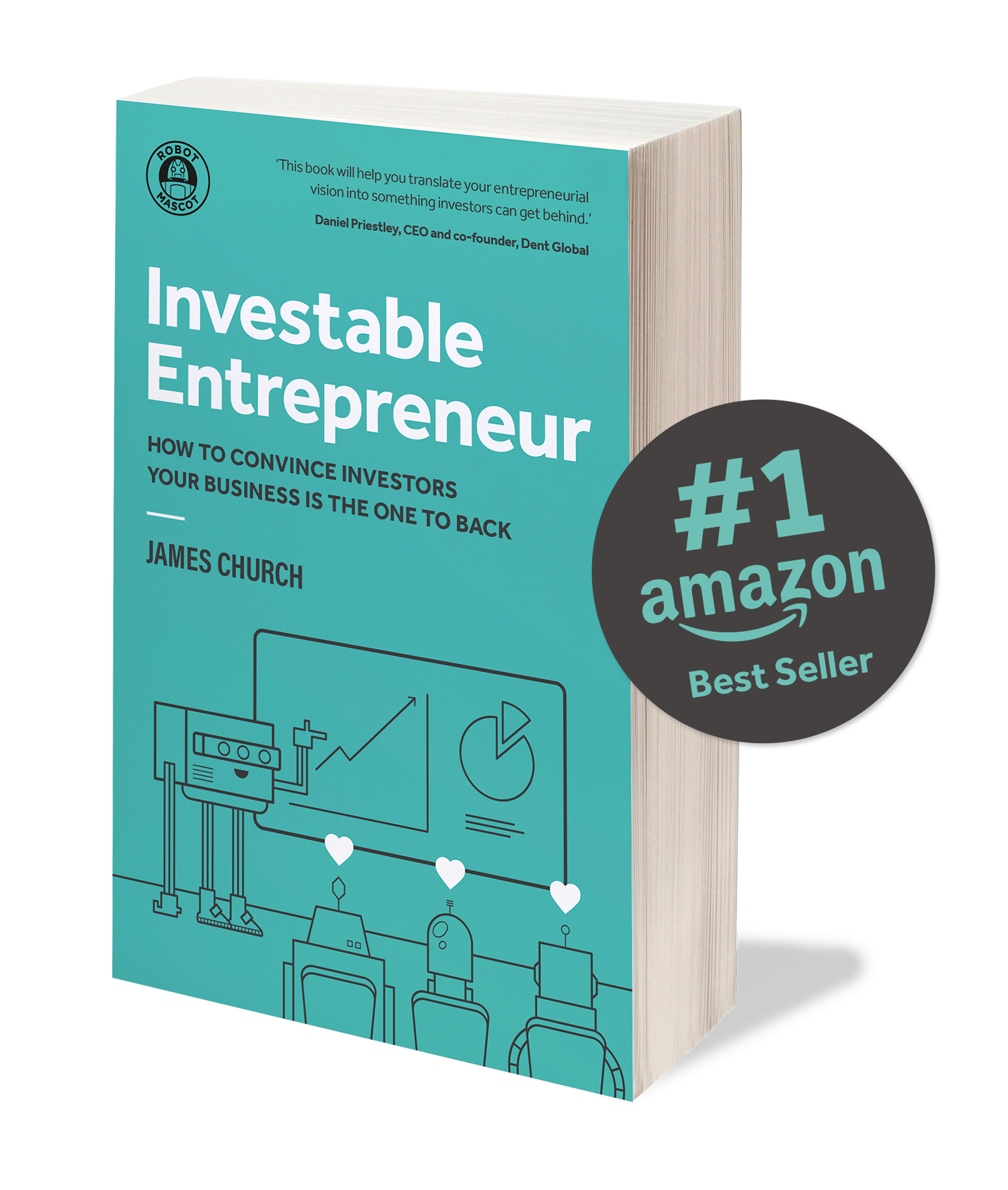
Claim your Free Copy of Investable Entrepreneur
Investable Entrepreneur takes you through our winning methodology – the process we use to increase our client’s chances of raising investment by more than 30x.
“This book will help you translate your entrepreneurial vision into something investors can get behind.”
Daniel Priestley, CEO and founder, Dent Global and four times best-selling business author

Keep up to date with what we’re up to via email


Copyright ©Robot Mascot Ltd. All rights reserved.


